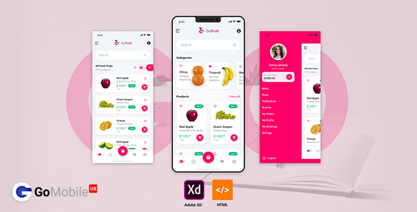
Go Mobile UX Multipurpose template, GoMobileUX is HTML, CSS and js templates. We have covered major HTML elements. Also customized widget elements with this. We’ll also expand it and always HTML 5 and major use of CSS3 we targeted. We also think of for future products and releases.
The framework we have used is bootstrap 4.3.1 version. So its uses flex-box properties and gives much smooth responsive utilities. The framework itself comes with responsive adjust into major devices small to large. Bootstrap templates designs also have wide range of templates.
As the latest technology and framework targeted it comes with Major all latest versions of browser Chrome, Safari, Firefox, IE 10+, Edge and opera. We also consider devices layout will be responsive which gives new touch.
Unique Design
Easy to customize and update
GoMobileUX comes with a lot of unique design, elements with 50+ pages and different demos.
Menu & Navigation
Provide more elasticity
Template comes with 3 kinds of menu Left side menu, Footer Menu and Right side filter area. Which gives more space to manage primary and secondary content. Go Mobile UX Multipurpose template.
Quick Share
Modal box with share options
We have placed share modal box for quick sharing. Also accessible as user’s thumb near to screen at bottom part in mobile devices. Also added recently connected people so user can easily share with near one.
Images: Dummy/Demo images used from pixabay.com. You can check licenses with respective website and use it.

