
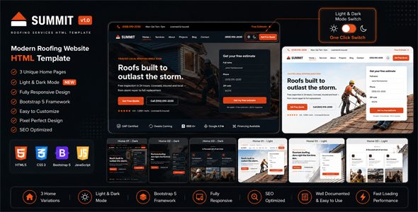
SummitRoof is a premium, conversion-first HTML5 template built for roofing companies, exterior contractors and home-services brands. The kit is engineered to a token-faithful design system with 114 CSS custom properties, real photography-grade typography (Sora display + Inter body, both Open Font License) and a cinematic per-scene motion layer — everything you need to launch a credible roofing site that ranks, converts and feels intentional on every screen.
This download ships with the full SummitRoof media kit: 11 fully-built pages, 3 homepage variants (Bold, Modern, Minimal), a complete photographic-style placeholder system across 7 categories, branded documentation and a one-page replacement cheat sheet. Drop your own photography into the matching placeholder folder and the design snaps to your brand with no HTML edits required.
What’s inside
- 11 pages — home (3 variants), about, services, service single, projects gallery, blog, blog single, contact and 404
- 3 homepage variants — full-bleed photographic hero (Bold), split hero with photo service cards (Modern), clean photo-led (Minimal)
- Conversion-first components — inline quote form on the hero, before/after slider, FAQ accordion, animated stats band, testimonials with avatars, sticky quote CTA
- Photography placeholder system — 23 premium SVG placeholders in 7 categories (hero, crew, tools, roofs, team, people, areas) sized to match the original layout slots
- Documentation — visual replacement guide, per-slot dimensions, recommended sources (Adobe Stock, Shutterstock, Envato Elements, AI generators, custom local photography) and Squoosh-based optimization workflow
Design & theming
- 114 design tokens mirroring the Figma system — colors, spacing, radius, shadows and type — change once, updates everywhere
- Three-tone palette — ember (CTA orange), slate (cool neutrals), steel (link blue) — hand-tuned for AA contrast
- Light + dark mode — auto from system preference, toggle in the header, prefers-color-scheme aware, no flash on first paint
- Typography — Sora (display) + Inter (body) referenced with a system-sans fallback; drop the woff2 files into
assets/fonts/for self-hosted production
Motion & interaction
- Cinematic per-scene rhythm — every section is assigned a tempo (hero, brisk, walk, immersive, gravity, crescendo, resolution) for a directed feel rather than a pile of effects
- Word-level headline reveals, scroll-revealed service cards, weighted smooth scroll (desktop only), pointer-parallax hero (desktop only), branded loader with repeat-visitor skip
- GPU-only animation — transform and opacity only, CLS ~0 across the entire kit
- prefers-reduced-motion honored across every animation, smooth scroll and parallax
Technical details
- No framework, no build step — pure HTML, design-token CSS and vanilla JavaScript;
file://openable, drops into any host or CMS - 11 modular JS files in
assets/js/motion/— each module is independent, remove any file to disable that feature - 4-layer CSS — motion tokens, design tokens + components, reveal engine, premium experience layer
- Responsive — mobile, tablet and desktop layouts with no horizontal overflow;
object-fit: coveron every image for clean crops at any ratio - Accessibility — visible focus rings, keyboard-operable nav and FAQ, ARIA on accordions and dialogs, skip link, screen-reader-clean word reveals
- Performance —
fetchpriority="high"on hero,loading="lazy"below the fold, ~15 KB motion footprint, no jQuery, no Bootstrap, no Swiper, no GSAP
How customers replace the photography
The downloadable package ships with a complete branded placeholder media system — every image slot is filled with a premium SVG placeholder that mirrors the original photo’s role, aspect ratio and visual weight. To swap in your own photography:
- Open
documentation/media-assets.htmlfor the visual catalog and per-slot recommended dimensions. - Resize your photos to match (1920 × 1080 for hero, 1600 × 1000 for gallery, 1000 × 1000 for avatars).
- Optimize to
.webpat quality 80 via Squoosh — target < 250 KB per image. - Replace the placeholder file with your photo at the matching path, keeping the same root filename. Done.
Sources for premium photography
We recommend custom local photography as the highest-quality option. For stock imagery use Adobe Stock, Shutterstock, Envato Elements, iStock or AI generators (Midjourney, Adobe Firefly, Google Imagen). Sources and per-crop guidance are listed in the included documentation.
Browser & device support
Tested on the latest stable releases of Chrome, Edge, Firefox and Safari across phone, tablet and desktop breakpoints. Forms are client-side demos — wire the data-quote-form action to your backend or email service for live use.
Files & folders
summitroof/— root HTML pages and AJT-JS folderassets/css/— motion-tokens.css, style.css, animations.css, premium.css (load order is fixed in every page)assets/js/motion/— 11 vanilla modules — loader.js, theme.js, reveal.js, header.js, beforeAfter.js, accordion.js, parallax.js, smooth-scroll.js and moreassets/images/placeholders/— 23 SVG placeholders across 7 categoriesdocumentation/— index.html, media-assets.html (visual replacement guide), photography-system.mdREPLACE-MEDIA.md— one-page replacement cheat sheetREADME.md,AUTHOR.md
Credits
Built entirely with first-party code by Design Garage Studio — no jQuery, no Bootstrap, no Swiper, no GSAP, no external JS libraries. Display font Sora and body font Inter are both Open Font License (OFL). The placeholder system is fully original SVG and free to ship with the kit.
© 2026 Design Garage Studio. Summit Roofing Co. used throughout sample content is a fictional demo brand, not the item author.